
Fortnite‘s cosmetic shop moves fast. Every week, Epic Games cycles through hundreds of skins, some iconic, some instantly forgettable, and some so visually jarring that players immediately regret dropping their V-Bucks. While everyone argues about their personal favorites, there’s surprising consensus around the worst Fortnite skins. These cosmetics range from poor design choices to clashing aesthetics that break Fortnite’s visual identity. Whether it’s awkward color schemes, overcomplicated details, or character models that don’t translate well in-game, certain skins have earned their place in the community’s hall of shame. This guide breaks down why some cosmetics stumble, which skins players universally dislike, and how to avoid wasting money on cosmetics you’ll regret wearing.
Key Takeaways
- Bad Fortnite skins typically fail due to poor color choices, overcomplicated designs, and character model issues that sacrifice clarity and functionality for unnecessary complexity.
- Universally disliked ugly Fortnite skins like Beef Boss, Peely, and Bushranger share common flaws: awkward proportions, clashing aesthetics, and animation problems that persist during gameplay.
- Epic Games has significantly improved cosmetic quality since 2020 by establishing stricter design standards, testing across all platforms, and learning from community feedback on failed skins.
- Preview skins thoroughly before purchase by rotating the model in-shop, testing in Team Rumble, and checking community reviews to avoid wasting V-Bucks on cosmetics you’ll regret wearing.
- Modern Fortnite cosmetics prioritize silhouette clarity, simple color blocking, and smooth animations over flashy but overcomplicated designs that create visual noise and gameplay distraction.
What Makes A Fortnite Skin Look Bad?
Not every unpopular skin is objectively ugly, some miss the mark for specific reasons that become obvious once you understand Fortnite’s design language. A bad skin typically fails in execution, clarity, or cohesion, and these issues compound when players have to stare at their character model for hours during matches.
Design Philosophy And Player Expectations
Fortnite’s skins fall into several archetypes: grounded military operators, superhero-inspired characters, pop culture crossovers, and fantasy cosmetics. Players expect consistency within these categories. When Epic releases a skin that violates its own design language, mixing incompatible aesthetics, using textures that feel out of place, or creating silhouettes that blur together in a crowded lobby, it stands out negatively.
Take oversaturated colors paired with muddy textures as an example. A skin might look decent in the cosmetics preview, but once you’re running through Tilted Towers at high contrast, the colors clash with the environment and each other. Players notice when a skin’s proportions feel off too. Fortnite has established character dimensions through hundreds of cosmetics: deviating too far creates an uncanny-valley effect that makes the skin feel cheap or rushed.
Expectations also shift based on pricing. A 1,500 V-Buck skin demands more polish and originality than a 800 V-Buck cosmetic. When players spend higher amounts and receive subpar design work, the disappointment hits harder. They’re willing to forgive small flaws in budget options, but premium skins face higher scrutiny.
Technical Limitations And Visual Clutter
Fortnite runs on varied hardware, from high-end PC rigs to older console models and mobile devices. This creates constraints for skin design. Details that look crisp on PC can become a muddy mess on lower-end systems, making the skin appear cheap or blurry. Smart design keeps visual clarity across all platforms.
Busy designs are the worst offender here. Cramming too many patterns, textures, and layers onto a single cosmetic creates visual noise. When a player wears the skin and their character model becomes a small viewport, all that complexity collapses into an unreadable blob. Compare a clean operator skin with simple color blocking to a fantasy cosmetic covered in intricate embroidery, metallic accents, and competing patterns, the latter loses definition immediately.
Animation compatibility also matters. Some skins have oversized shoulders, flowing capes, or protruding accessories that clip through the character model during certain emotes or animations. A skin that looks sharp standing idle can look completely broken while executing a built-in emote or during the iconic lobby victory pose. Poor rigging and animation testing create distracting visual glitches that make the cosmetic feel unfinished, even if the base design is solid.
The Most Universally Disliked Skins
Some skins achieve legendary status, but for all the wrong reasons. These cosmetics appear on almost every “worst skins” list because the community consensus is unanimous.
Tier-One Offenders: Widely Criticized Cosmetics
Beef Boss (and its variants) represents a perfect storm of poor decisions. The massive hamburger head, clashing colors, and overall silhouette make it one of Fortnite’s most meme-worthy cosmetics. While some players ironically love it, most agree the skin doesn’t look good, it looks awkward. The proportions are exaggerated to the point of absurdity, and unlike intentionally goofy skins that own their ridiculousness, Beef Boss seems confused about whether it’s serious or comedic.
Peely (the original banana skin) sits in a complicated space. It’s iconic, sure, but the blocky proportions, limited animation rigging, and visibility issues in-game make it functionally ugly. Your character becomes a literal cylinder that obscures your view when aiming down sights. Peely spawned better versions later (Peely Bone, Shadow Peely), which suggests Epic recognized the design had problems.
Fishstick generated polarized opinions, but its proponents are outnumbered. The oversized fish head, awkward posture, and texture that makes the skin look like a deflated balloon all contribute to its reputation. When the skin first released, people immediately recognized it as one of Fortnite’s lowest points in cosmetic design.
Bushranger tries to be quirky but lands somewhere between creepy and poorly executed. The bulbous proportions, the strange face modeling, and overall awkwardness make this skin universally roasted. Unlike skins that lean into intentional goofiness with confident design, Bushranger feels like a mistake that shipped anyway.
Community Consensus On Problematic Skins
Beyond the obvious offenders, the community has identified patterns in unpopular skins. Skins based on real people sometimes fall flat because realistic facial proportions don’t translate well into Fortnite’s stylized aesthetic. Celebrity collaborations occasionally suffer because the likeness takes priority over functional game design.
Color variants matter too. A solid skin can become instantly worse with a terrible color recolor. Certain skins from 2018-2019 have aged poorly because their aesthetic doesn’t match modern cosmetics standards. As Epic’s design team improved, older skins started looking dated and clunky by comparison. The contrast became unavoidable when these legacy skins appear in the shop alongside current releases.
Why Certain Skins Flopped With The Player Base
Bad skins don’t exist in a vacuum. Understanding why specific cosmetics failed reveals patterns that Epic should avoid.
Poor Color Choices And Aesthetic Mismatches
Color theory matters in game design. Clashing colors, particularly when they lack contrast or harmony, make a skin feel amateur. A bright neon green paired with muddy orange, or a skin using five competing colors without a coherent palette, immediately signals poor design.
Aesthetic mismatches occur when Epic tries to force crossovers or themes that don’t belong in Fortnite’s world. Some collaborations work seamlessly (Travis Scott, The Mandalorian), while others feel shoehorned. When a skin’s visual style contradicts the established tone, like an ultrarealistic military operator sitting next to a cartoon character, the incongruity creates discomfort that makes both skins look worse.
Skins from certain collaboration eras (particularly early crossovers) suffer from this. The artists prioritized brand accuracy over Fortnite’s aesthetic, resulting in cosmetics that feel like they wandered in from a different game entirely. Modern collabs understand the assignment better, which is why recent partnerships (2024-2026) generally land better with players.
Overcomplication And Busy Design Elements
Less is often more in cosmetic design. Skins that work best use simple color blocking, clear silhouettes, and purposeful details. Overcomplication sabotages even solid base concepts.
Skins with excessive layering suffer from clarity loss. Too many straps, pouches, belts, and accessories create visual noise that distracts from the character’s overall shape. When a player glances at their character in a lobby or during gameplay, they should recognize the cosmetic instantly. Overcomplicated designs create ambiguity, viewers can’t tell what they’re actually looking at.
Pattern overuse amplifies this. A skin covered in multiple clashing patterns, stripes, and textures becomes visually aggressive. The eye doesn’t know where to focus. Compare a skin with clean lines and 2-3 cohesive patterns to one with five competing visual elements, and the cleaner option always wins. Fortnite’s best cosmetics (like Superhero skins or clean operator variants) use restraint, proving that simplicity improves aesthetics.
Character Model Issues And Animation Problems
Fortnite uses a base character skeleton for all skins, which means cosmetics must fit within specific proportions. Skins that deviate too far create rigging problems and animation conflicts. Oversized shoulders, misaligned limbs, or disproportionate heads cause animations to look unnatural or broken.
Some skins shipped with clipping issues, geometry intersecting during movement or emotes. Capes clip through backs, accessories intersect with arms, and oversized clothing phases through the character model during common actions. These problems weren’t fixed immediately, frustrating players who paid V-Bucks for broken cosmetics.
Animation rigging also determines how naturally a skin moves. A skin with poor weight distribution looks stiff or floaty during sprinting, building, and combat actions. Peely’s animation problems are notorious, the cylindrical body doesn’t rotate correctly, making aiming feel off. A skin that moves wrong feels wrong, regardless of how good the base design looks in preview.
How Epic Games Has Improved Skin Design Over Time
Early Fortnite cosmetics were experimental. Epic hadn’t yet established design standards, and some skins reflected that lack of direction. The company’s learning curve is visible across the cosmetics catalog.
Learning From Past Mistakes
Epic’s response to failed skins shows maturity. Rather than doubling down on unpopular designs, the company released improved variants. Peely Bone and Shadow Peely addressed the original’s visibility and animation problems. These redesigns proved that Epic recognized the issues and actively worked to correct them.
Design standards tightened significantly after 2020. Modern skins rarely exhibit the proportional awkwardness or color chaos of early cosmetics. Epic’s team established clearer guidelines: maintain silhouette clarity, respect character skeleton constraints, test across all platforms, and ensure animation compatibility.
Collaboration strategy improved too. Current crossovers integrate IP characters more thoughtfully, blending brand identity with Fortnite’s aesthetic rather than forcing disconnects. The recent collaborations (2024-2026) demonstrate this evolution, characters adapt to the Fortnite world instead of feeling transplanted from elsewhere.
Quality control increased. Cosmetics now go through more rigorous testing before release. Clipping issues, animation problems, and color palette conflicts get caught during development rather than shipped and patched months later. Players notice the difference, newer skins simply function better.
Recent Trends In Cosmetic Quality
Fortnite’s cosmetic quality has tracked upward consistently since 2022. The gap between the best and worst current skins is narrower than ever, and even “bad” modern cosmetics outshine the worst from earlier eras.
Fan-Favorite Skins That Set The Standard
Communities across platforms like Dexerto regularly highlight standout cosmetics. The Foundation (Seven series), Superhero skins, Clean Sweeper, and Aura consistently appear in top-tier lists because they nail the fundamentals: clear silhouettes, excellent color blocking, proportional accuracy, and smooth animations.
These skins prove what works. Clean designs with purposeful details perform better than overcomplicated alternatives. The most praised cosmetics use restrained color palettes, typically 2-3 primary colors with accents. They avoid clashing patterns and maintain visual hierarchy.
Community feedback directly influences future releases. When a skin succeeds, Epic notes the design elements. When one fails (internally or via community consensus), the company adjusts its approach. Recent releases show clear application of these lessons, better cohesion, smarter proportions, and more polished execution across the board.
What Gamers Want In Modern Fortnite Cosmetics
Fortnite players prioritize function over flashiness. They want skins that look good, animate smoothly, and don’t interfere with gameplay visibility. A cosmetic doesn’t need to be flashy if it’s well-designed, understated cosmetics frequently outperform loud alternatives in player satisfaction.
Silhouette clarity is non-negotiable. Players instantly recognize their own skin in a lobby and distinguish it from teammates and opponents at distance. Cosmetics that blur together or obscure the character model fail this test immediately. Guides on GamesRadar+ frequently emphasize this aspect when recommending skins, noting that competitive viability depends partly on visual clarity.
Authenticity matters too. Skins that feel genuine to their concept, whether that’s a grounded soldier, a fantasy character, or a pop culture crossover, connect better with players. Half-measures and compromised designs feel cheap, regardless of price. Players would rather buy five solid cosmetics than spend the same V-Bucks on one mediocre premium skin.
Rarity perception affects value. Limited-time exclusive skins command loyalty even years later because scarcity creates emotional investment. A well-designed battle pass skin can hold its value longer than a mediocre shop cosmetic released monthly. Epic understands this distinction now and ensures exclusive cosmetics receive extra design attention.
Tips For Choosing Skins You’ll Actually Enjoy
Most V-Bucks regret stems from impulse purchases. A skin looks decent in the preview, you buy it, and three matches later you’re back to your main cosmetic. Learning to evaluate skins before purchasing saves time and money.
Preview Before Purchase Strategies
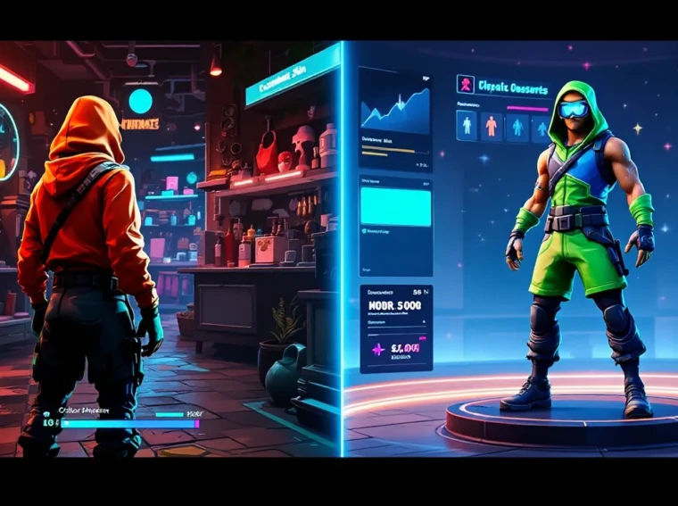
Fortnite’s preview system is your first defense. Don’t just look at the skin in the cosmetics shop preview, rotate the character model, inspect it from multiple angles, and check the back. A skin can look great from the front and terrible from behind (important if you spend time in vehicles or in builds where your back is visible).
Load into Team Rumble and test the skin before committing. Seeing it in-game, during actual movement and building, reveals issues that preview screens hide. Pay attention to visibility issues when aiming down sights and whether the silhouette remains clear at distance. Spend five minutes running through environments and you’ll immediately know if the cosmetic works for you.
Watch skin reviews on platforms like Twinfinite, where content creators preview cosmetics thoroughly. They’ll test animations, show how the skin performs in various lighting conditions, and highlight any issues you might miss. Community feedback on cosmetics is ruthlessly honest, if a skin is clunky, players will tell you immediately.
Check color variants before choosing. Skin colors matter more than you’d expect. A gorgeous base design can look terrible in specific color variants. If you’re uncertain about a cosmetic, wait a few days and watch the community react. You’ll know within 48 hours whether the skin is considered a miss.
Balancing Aesthetics With Competitive Viability
Personal preference comes first, but competitive considerations matter if you play ranked. Brighter skins with high contrast are visually striking but also more visible to opponents. Darker, more subdued cosmetics provide slight visibility advantages in shadows and low-light areas.
This doesn’t mean you need to wear a full-black sweaty skin to compete. Modern map design, dynamic lighting, and balance changes have largely eliminated visibility-based pay-to-win arguments. A skin you love playing in is always better than a competitive skin you resent wearing. Confidence in your cosmetic choice translates to better gameplay.
That said, avoid skins with mechanical problems. Oversized proportions that create rigging issues, or cosmetics with animation flaws, can genuinely impact your ability to aim or build efficiently. Test the skin’s mechanics before committing to it as your main.
Budget considerations matter too. Save V-Bucks for skins that will last. Battle pass cosmetics (usually 950 V-Bucks) often provide better value than shop cosmetics (1,500+ V-Bucks). Battle pass skins go through more rigorous design testing and feel more polished overall. You’re statistically safer investing in the pass than rolling the dice on a random shop release. Many players adopt a “never buy shop skins on first release” policy, waiting for community verdict before purchasing at full price.
Conclusion
Fortnite’s cosmetic landscape has evolved dramatically since the early days of Beef Boss and Peely. While ugly skins still release occasionally, they’re increasingly rare as Epic’s design standards sharpen. Modern cosmetics prioritize clarity, functionality, and authentic execution, lessons learned from years of community feedback and analytical observation of what works.
The worst Fortnite skins teach valuable lessons about design execution: simplicity trumps complexity, color coherence matters, and function must align with form. Not every skin will appeal to everyone, but truly bad cosmetics fail on technical and design fundamentals that affect all players regardless of preference.
Before dropping V-Bucks on a new cosmetic, use preview tools, test in-game, and check community reaction. You’ll avoid regret and ensure your cosmetics collection contains skins you actually want to wear. In 2026, Epic Games has proven it understands quality design, hold new releases to that standard and you’ll build a cosmetics loadout that stands the test of time.